
Interactive Visualizations using NOAA Climate Data
In this post I will be demonstrating the functions I wrote to query climate data from the NOAA and create interactive visualizations.
Create a Database
To create a database from the NOAA climate data, sqlite3 creates the database and queries data, and pandas to manipulates dataframes.
#import libraries
import sqlite3
import pandas as pd
#connect to database
conn = sqlite3.connect("temps.db")
The temperature data had to be cleaned. The following function prepare_df reorganizes the temperature data so that we can use it properly.
#clean temperature data
def prepare_df(df):
df = df.set_index(keys=["ID", "Year"]) #index the datafram by ID and Year
df = df.stack() #stack all the data values into a new column
df = df.reset_index() #reset index to ID and Year
df = df.rename(columns = {"level_2" : "Month" , 0 : "Temp"}) #rename the new columns
df["Month"] = df["Month"].str[5:].astype(int) #extract the month number
df["Temp"] = df["Temp"] / 100 #convert data to units of Celcius
return(df)
The temperature data set contains many rows, so the data is loaded into the database in chunks. The following loop iterates through the 100000 rows of the data at a time, cleaning it with the prepare_df and adding it to the database.
# load temperature data into database in chunks
df_iter = pd.read_csv("temps.csv", chunksize = 100000)
for df in df_iter:
df = prepare_df(df) #clean the data
df.to_sql("temperatures", conn, if_exists = "append", index = False) #add to existing data
Now the temperature table in the database is complete. The following code will read in the station data and country data and add them as individual tables in the database.
#load station data into database
url1 = "https://raw.githubusercontent.com/PhilChodrow/PIC16B/master/datasets/noaa-ghcn/station-metadata.csv"
stations = pd.read_csv(url1)
stations.to_sql("stations", conn, if_exists = "replace", index = False)
#load country name data into database
url2 = "https://raw.githubusercontent.com/mysociety/gaze/master/data/fips-10-4-to-iso-country-codes.csv"
stations = pd.read_csv(url2)
stations = stations.rename(columns = {"FIPS 10-4" : "FIPS", "ISO 3166" : "ISO", "Name" : "Country"}) #rename so no spaces in column names
stations.to_sql("countries", conn, if_exists = "replace", index = False)
Now that the tables are in the temps database, the following code checks what tables are present in the database and what columns are in each table.
#check and see what is in the database
cursor = conn.cursor()
cursor.execute("SELECT sql FROM sqlite_master WHERE type='table';")
for result in cursor.fetchall():
print(result[0])
CREATE TABLE "temperatures" (
"ID" TEXT,
"Year" INTEGER,
"Month" INTEGER,
"Temp" REAL
)
CREATE TABLE "stations" (
"ID" TEXT,
"LATITUDE" REAL,
"LONGITUDE" REAL,
"STNELEV" REAL,
"NAME" TEXT
)
CREATE TABLE "countries" (
"FIPS" TEXT,
"ISO" TEXT,
"Country" TEXT
)
This confirms that the data is properly loaded into the database! The three tables are temperatures, stations, and countries, and we can see the row and column names for each table. Now close the connection to the database.
conn.close()
Write a Query Function
I created a query function for the temps database. It takes four arguments: a country, two integers that give the earliest and latest years, and a month for which the data should be returned. The function outputs a pandas dataframe of temperature readings for the specified country, in the specified date range, and in the specified month of the day.
def query_climate_database(country, year_begin, year_end, month):
'''
Input a country, the years that bound the data, and the month
The function returns a dataframe of the specified country in the specified date range in the specified month
'''
cmd = \
'''
SELECT S.NAME, S.LATITUDE, S.LONGITUDE, C.Country, T.Year, T.Month, T.Temp
FROM temperatures T
LEFT JOIN stations S ON T.id = S.id
LEFT JOIN countries C on SUBSTRING (T.id, 1, 2) = C.FIPS
WHERE T.Year >= {a} AND T.Year <= {b} AND T.Month = {c} and C.Country = '{d}'
'''.format(a=year_begin, b=year_end, c=month, d=country)
conn = sqlite3.connect("temps.db")
df = pd.read_sql_query(cmd, conn)
conn.close()
return df
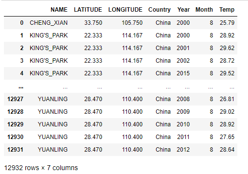
Here’s an example of using the function query_climate_database to query temperature data in China for August from 2000-2020.
query_climate_database(country = "China",
year_begin = 2000,
year_end = 2020,
month = 8)
Creating Interactive Visualizations
I have created three interactive visualizations that showcase different aspects of the NOAA climate data.
Geographic Scatter Function for Yearly Temperature Increase
This first visualization addresses the question: How does the average yearly change in temperature vary within a given country?
A few packages will be necessary to achieve this. sklearn is used for linear regression, datetime converts numbers to their corresponding month names, and plotly is used to create the interactive visualizations.
from sklearn.linear_model import LinearRegression
import datetime
from plotly import express as px
The coef function uses linear regression to give an estimated yearly change in temperature.
def coef(data_group):
'''
Input dataframe
Returns slope of linear model, representing the average yearly change in temperature
'''
x = data_group[["Year"]] # 2 brackets because X should be a df
y = data_group["Temp"] # 1 bracket because y should be a series
LR = LinearRegression()
LR.fit(x, y)
return LR.coef_[0] #simple estimate of rate of change per year
The function temperature_coefficient_plot queries the specified data and produces a geographic scatterplot. The location of each point is the location of the station and the color is based on the estimate of yearly change in temperature at the station in the given time interval.
def temperature_coefficient_plot(country, year_begin, year_end, month, min_obs, **kwargs):
'''
Input a country, a bounded time interval, a month, and the minimum data points to be considered, and optional plotting arguments
Returns a geographic figure indicating the changes in temperature over time
'''
#obtain and clean the data
df = query_climate_database(country, year_begin, year_end, month) #read in the data using previously defined function
counts = df.groupby(["NAME", "Month"])["Year"].transform(len)
df = df[counts >= min_obs]
coefs = df.groupby(["NAME", "Month", "LATITUDE", "LONGITUDE"]).apply(coef) #find the estimated yearly change in temperature for each station
coefs = coefs.round(3) # round data to 3 decimal places
coefs = coefs.reset_index()
coefs = coefs.rename(columns = {0 : "Estimated Yearly Change (C)"})
#create the plot
title = "Estimates of Yearly Increase in Temperature in {a} for stations in {b}, years {c} - {d}"\
.format(a=datetime.date(2021, month, 1).strftime('%B'), b=country, c=year_begin, d=year_end)
fig = px.scatter_mapbox(coefs,
lat = "LATITUDE",
lon = "LONGITUDE",
hover_name = "NAME",
color = "Estimated Yearly Change (C)",
title = title,
**kwargs)
return fig
Here is an example of using the temperature_coefficient_plot function to visualize the estimated change in temperature across stations in India in January from 1980 to 2020. Notice how more than 4 arguments can be passed to the function as keyword arguments.
fig = temperature_coefficient_plot("India", 1980, 2020, 1,
min_obs = 10,
zoom = 2,
mapbox_style="carto-positron",
color_continuous_scale=color_map,
color_map = px.colors.diverging.RdGy_r
)
fig.show()
We can see here that redder points are stations where the estimated yearly temperature is increasing and blacker points are stations where the estimated yearly temperature is decreasing. Now we have a visual that shows how the average yearly temperature varies across a country.
Barplot Showing the Difference in Mean Temperature per Year and Overall Mean Temperature
The geographic visualization above shows that temperature is changing across stations. The following visualization answers the question: How is the mean temperature per year changing in comparison to the overall mean temperature?
The package numpy will be used to take averages of temperature data.
import numpy as np
The function diff_from_mean_temp takes in the same arguments as the query_climate_database: country, year_begin, year_end, and month. With the returned dataframe, it takes the mean temperature over the entire time period and then finds the difference between the mean temperature of each year and the overall mean temperature. This data is displayed on an interactive barplot.
def diff_from_mean_temp(country, year_begin, year_end, month, **kwargs):
'''
Input a country, a bounded time interval, and a month
Returns a barplot comparing the yearly temperature to the average temperature over the interval
'''
#obtain and clean the data
df = query_climate_database(country, year_begin, year_end, month) #read in the data using previously defined function
mean = np.mean(df["Temp"]) #overall mean temperature of the time interval
df = df.groupby(["Year"])["Temp"].aggregate(np.mean) #find mean temperature per year
df = df.reset_index()
df["Difference (C)"] = df["Temp"] - mean #compare mean temperature of year to mean temperature over entire time interval
df= df.round(3) #round to 3 decimal places
df["col"] = np.where(df["Difference (C)"]>=0, 'red', 'blue')
#create the plot
title = "Difference in Mean Temperature in {a} for stations in {b} from {c} to {d}"\
.format(a=datetime.date(2021, month, 1).strftime('%B'), b=country, c=year_begin, d=year_end)
fig = px.bar(df, x = "Year", y = "Difference (C)",
hover_data = ["Year", "Difference (C)"], title = title, color = "col", **kwargs)
fig.update_layout(showlegend=False) #hide the legend
return fig
Here is an example of using the diff_from_mean_temp function to visualize the difference in mean temperature in Canada in March from 1950 to 1970.
fig = diff_from_mean_temp("Canada", 1950, 1970, 3)
fig.show()
Here we can see the positive red bars indicate that the temperature readings that year were above the mean, and negative blue bars indicate that temperature readings that year were below the mean.
Scatterplot for Variantion in Temperature and Latitude
The following visualization answers the question: How does the variation in temperature vhange across a country given the latitude of the station?
The function latitude_and_vartemp takes in the same arguments as the query_climate_database, country, year_begin, year_end, and month. It also takes an argument min_obs that specified the minimum observations from a station for its data to be included. With the returned dataframe, the function aggregates the data to calculate the variance in temperature from each station in the given time interval. A scatterplot is created that compares the latitude of the station to the variance of temperature readings in the time period.
def latitude_and_vartemp(country, year_begin, year_end, month, min_obs, **kwargs):
'''
Input a country, a bounded time interval, and a month
Returns a scatterplot comparing the latitude of a station and the variance in temperature reading over the time interval
'''
df = query_climate_database(country, year_begin, year_end, month) #read in the data using previously defined function
counts = df.groupby(["NAME", "Month"])["Year"].transform(len)
df = df[counts >= min_obs] #only include data with at least min_obs observations
df = df.groupby(["NAME", "LATITUDE", "LONGITUDE"])["Temp"].apply(np.var) #calculate mean temp at station over time interval
df= df.round(3) #round to 3 decimal places
df = df.reset_index()
df = df.rename(columns = {"Temp" : "Variation in Temp (C)"}) #rename variation in temperature column
#create the plot
title = "Latitude and Variation in Temperature Readings in {a} for stations in {b} from {c} to {d}"\
.format(a=datetime.date(2021, month, 1).strftime('%B'), b=country, c=year_begin, d=year_end)
fig = px.scatter(df, x="LATITUDE", y="Variation in Temp (C)", hover_name = "NAME", color = "Variation in Temp (C)", title = title, **kwargs)
return fig
Here is an example of using latitude_and_temp to visualize the variation in temperature readings across stations of various latitudes in Australia in December from 1970 to 2000.
fig = latitude_and_vartemp(country = "Australia",
year_begin = 1970,
year_end = 2000,
month = 12,
min_obs = 10)
fig.show()
Notice here how the variance in temperature appears to be the greatest around latitude -35. It would be interesting to explore what factors in these areas lead to an increased variation in temperature readings such as environmental conditions, distance to the ocean, whether the area is urban or rural, etc.
Thanks for reading my post about interactive climate visualizations!